Hello & thank you for purchasing Platform!
Let's start with the essential steps to ensure a smooth setup and customization process. This tutorial will help you get started with the Platform.
Premium Framer Template
Platform® — Modular Landing Page
Transform your landing page with a premium modular template built for modern tech, featuring strategic design, smart animations, and well-structured layouts that showcase your digital products with professional precision.

Important First Step
Before making any changes
1. Open Platform in Framer
2. Click "..." (three dots) in the project menu
3. Select "Duplicate project"
4. Rename it "Platform - Original Backup"
5. Keep this version untouched in case you need it in the future
Before You Start Editing
Double-Check Your Working Version
1. Make sure you are using the latest version of Platform.
2. Always work on your main copy, not the backup
3. Rename the working copy to your company or project name
4. Replace the default social preview, fav icons in the top settings menu.
5. Familiarize yourself with Platform. Play around the interface, test the interactive elements
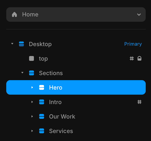
Sitemap
Helps to find sections, pages in the hierarchy

Home
1.
2.
3.
4.
5.
6.
7.
8.
9.
10.
11.
12.
13.
14.
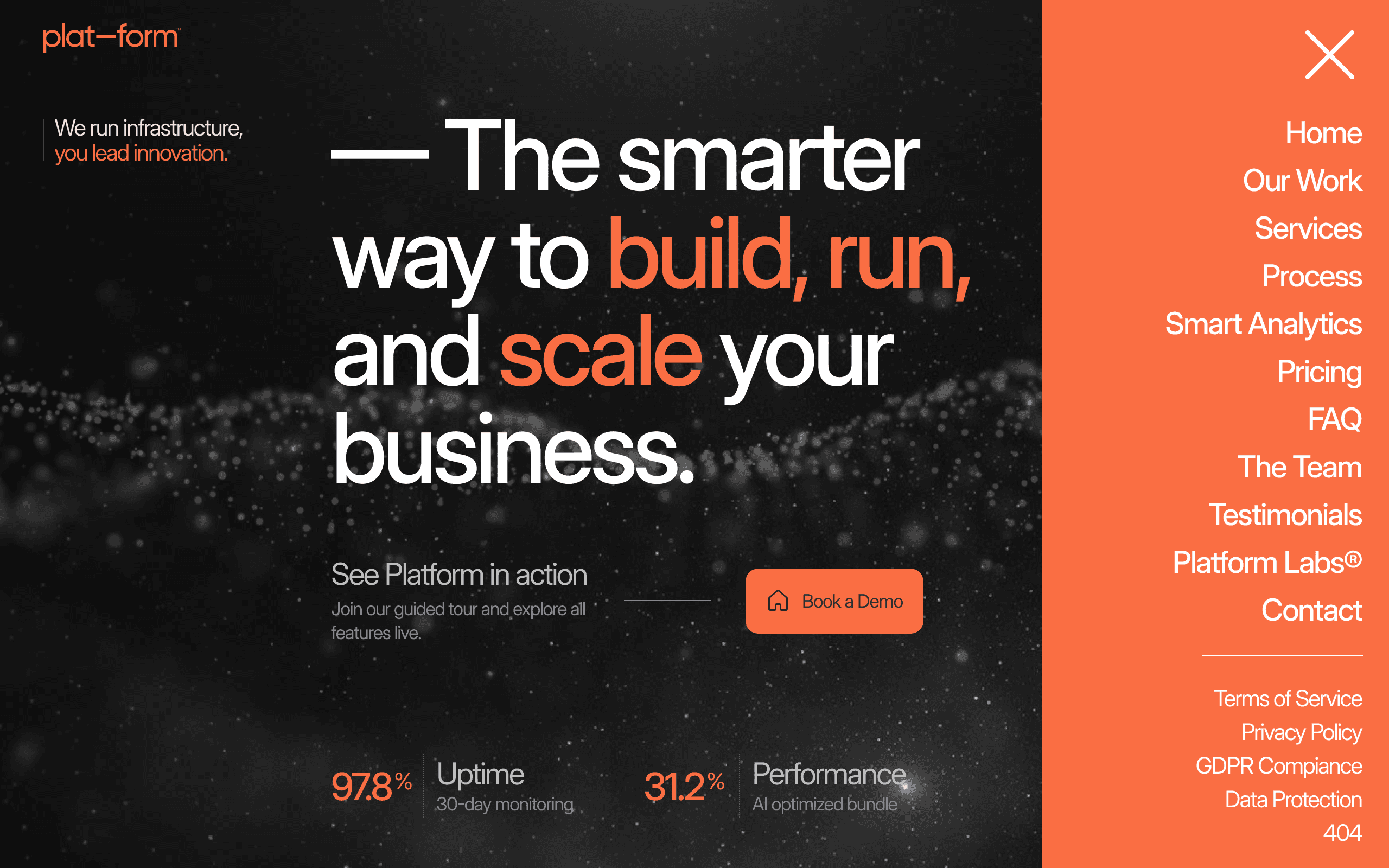
Hero
Intro
Our Work
Services
Process
Analytics
Pricing
FAQ
The Team
Testimonials
Blog Teaser
Tickers
Contact
Footer
Pages
1.
2.
3.
4.
5.
6.
7.
8.
Home
Services
Platform Labs - Blog
Terms of Service
Privacy Policy
GDPR Compliance
Data Protection
404
Tutorials
Quick navigation through organized sections
Screenshot
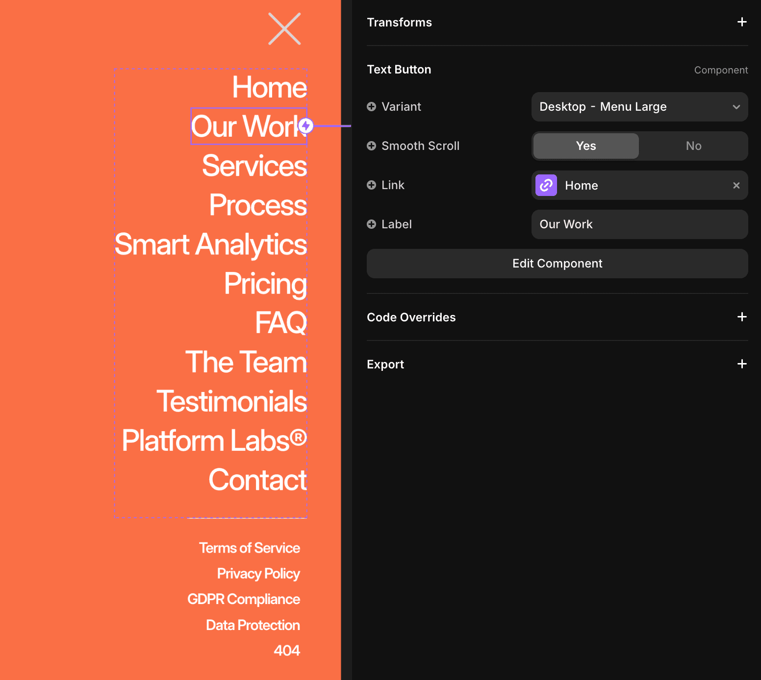
Navigation
Navigation Component
A unified navigation component that combines your logo and burger menu in one fixed header element.
Sidebar
Where to Find
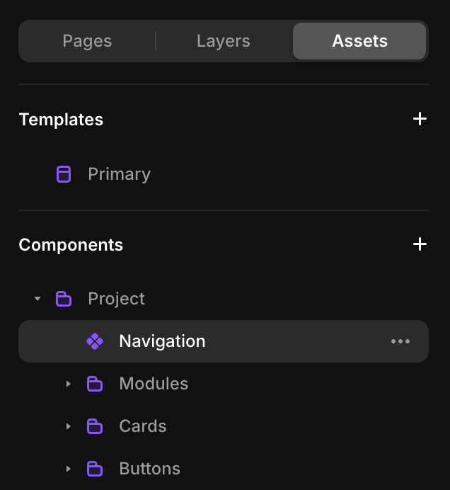
1. Open Assets panel in left sidebar
2. Navigate to: Components → Project → Navigation
3. Click to reveal in the editor
Available in the template
Navigation
Component
How it Works
Click any menu item to access its settings in the property panel, where you can:
Important:
Make all menu edits in Desktop View - tablet and mobile views will automatically adapt to your changes.

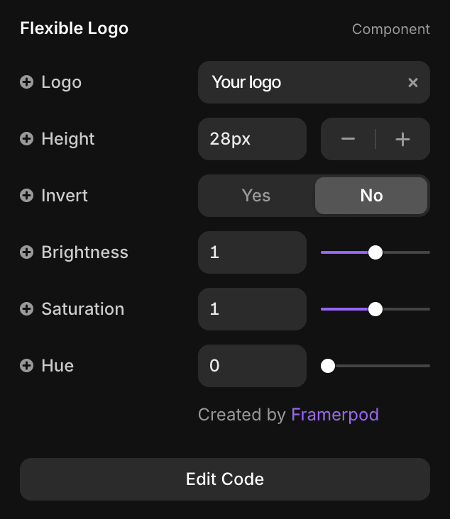
Logo Component
The template includes a flexible logo component designed to display your logo in the best size and format, with built-in adjustment options.
Sidebar
Where to Find
1. Open Assets panel in left sidebar
2. Navigate to:
Components → Project → Navigation → Flexible Logo
3. Click to reveal in the editor
Available in the template
Navigation
Header Card
Footer
Component
How it Works
1. Select the Flexible Logo component
2. In the right-hand property panel, upload your logo fille
3. Set the logo height — the width will adjust automatically.
Use the adjustment controls to: Invert, Brighten, Saturate, Hue. Leave all settings at 0 if no adjustments are needed.
Best result:
Upload high-resolution SVG file if available ensure sharp display across all devices.
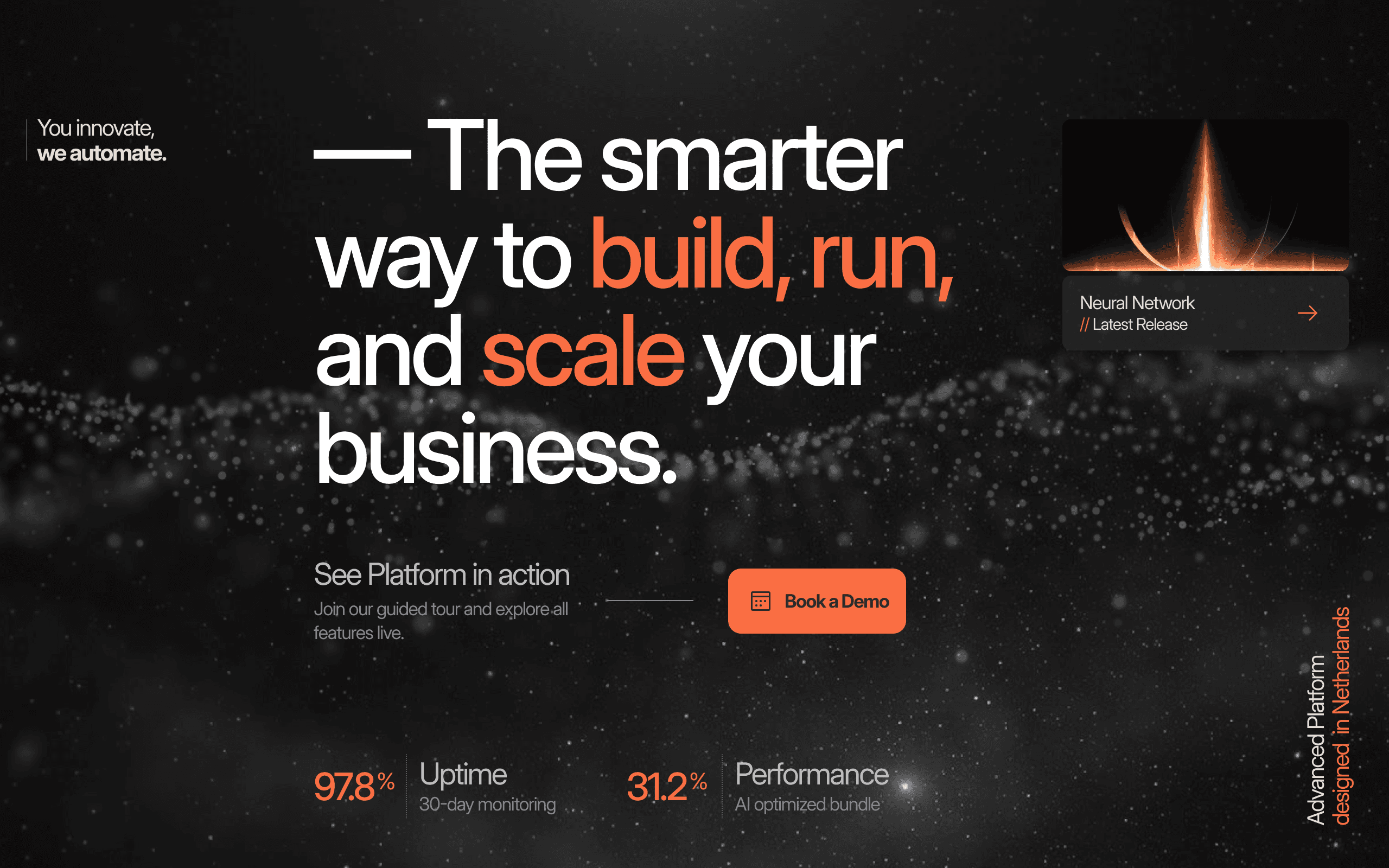
Hero
Hero Section
Direct text editing functionality for all text elements in your hero section.
Where to Find
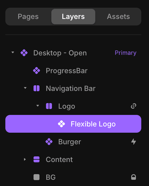
1. Open Layers panel in left sidebar
2. Navigate to: Sections → Hero
3. Edit content directly

Direct text editing
1. Double-click any text field to edit
2. Type your new content
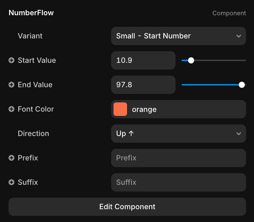
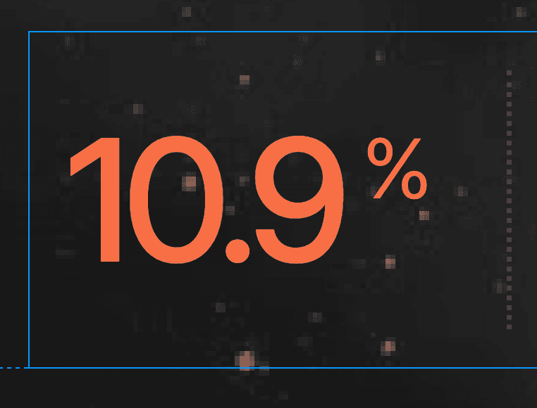
Spinning Numbers
Simply click on any orange number in the hero section to open NumberFlow settings in the property panel.
1. Choose variant: "Small - Start Number"
2. Set start and end values
3. Choose direction (Up ↑ or Down ↓)
4. Add optional prefix (like +, $, etc.)
5. Add optional suffix (like %, k, etc.)
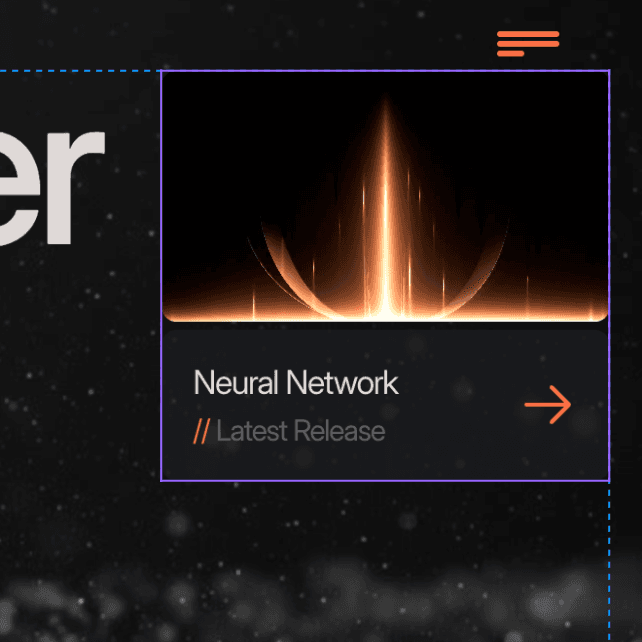
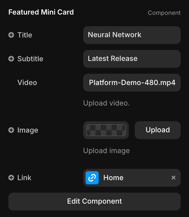
Featured Project / Mini Card
A compact card component that sits on the right side of the hero section. Upload an image or video to showcase a project preview.
1. Edit title, subtitle
2. Upload either mage or video
3. Set link destination

Screenshot
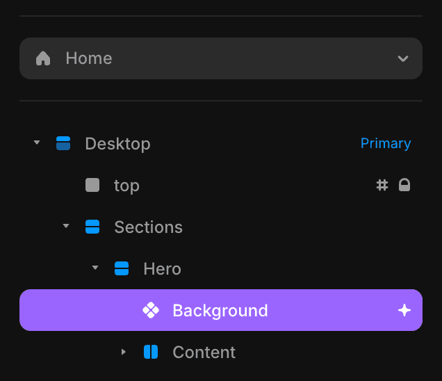
Background
Animated Dynamic Background
A dynamic background component combining looped video and image layers with adjustable effects.
Sidebar
Where to Find
1. Open Layers panel in left sidebar
2. Navigate to: Sections → Hero → Background
3. Click to reveal properties in right panel
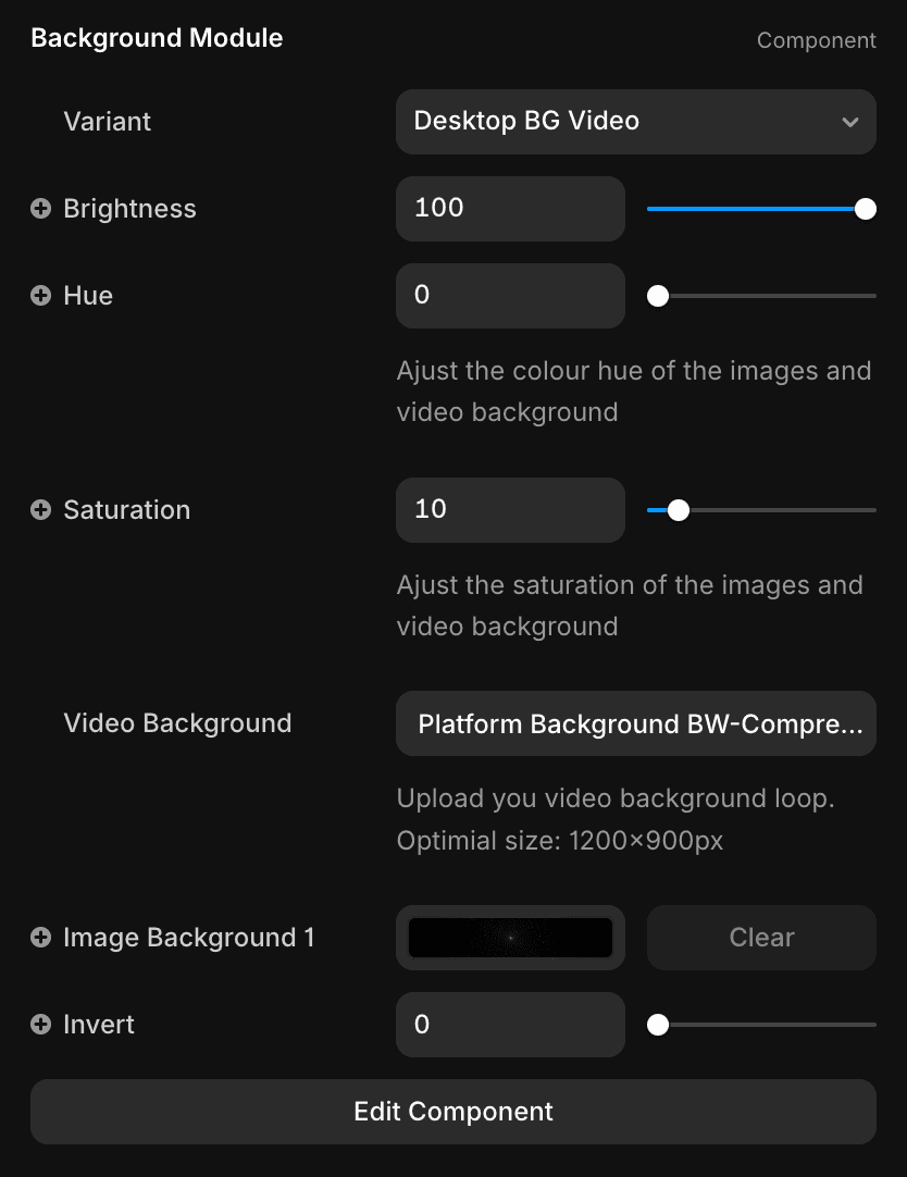
Property panel
How it Works
1. Upload video background ( looped ideally)
2. Add background image layer
3. Available effects: Brightness, Hue, Saturation, Invert
Important:
Effects apply to both video and image layers simultaneously for consistent styling.

Screenshot
Intro
Intro Text Reveal
The component adds captivating, scroll-triggered text animations. As you scroll, text is revealed letter by letter, creating a dynamic and engaging experience.
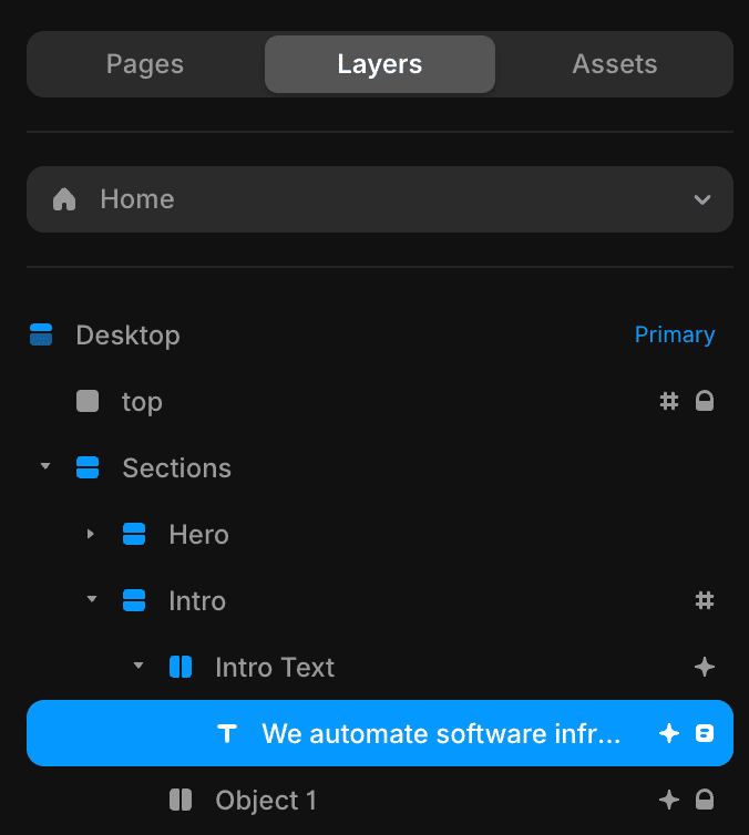
Sidebar
Where to Find
1. Open Layers panel in left sidebar
2. Navigate to: Sections → Intro → Intro Text
3. Click to reveal properties in right panel

Property panel
How it Works
1. Replace intro text
Screenshot
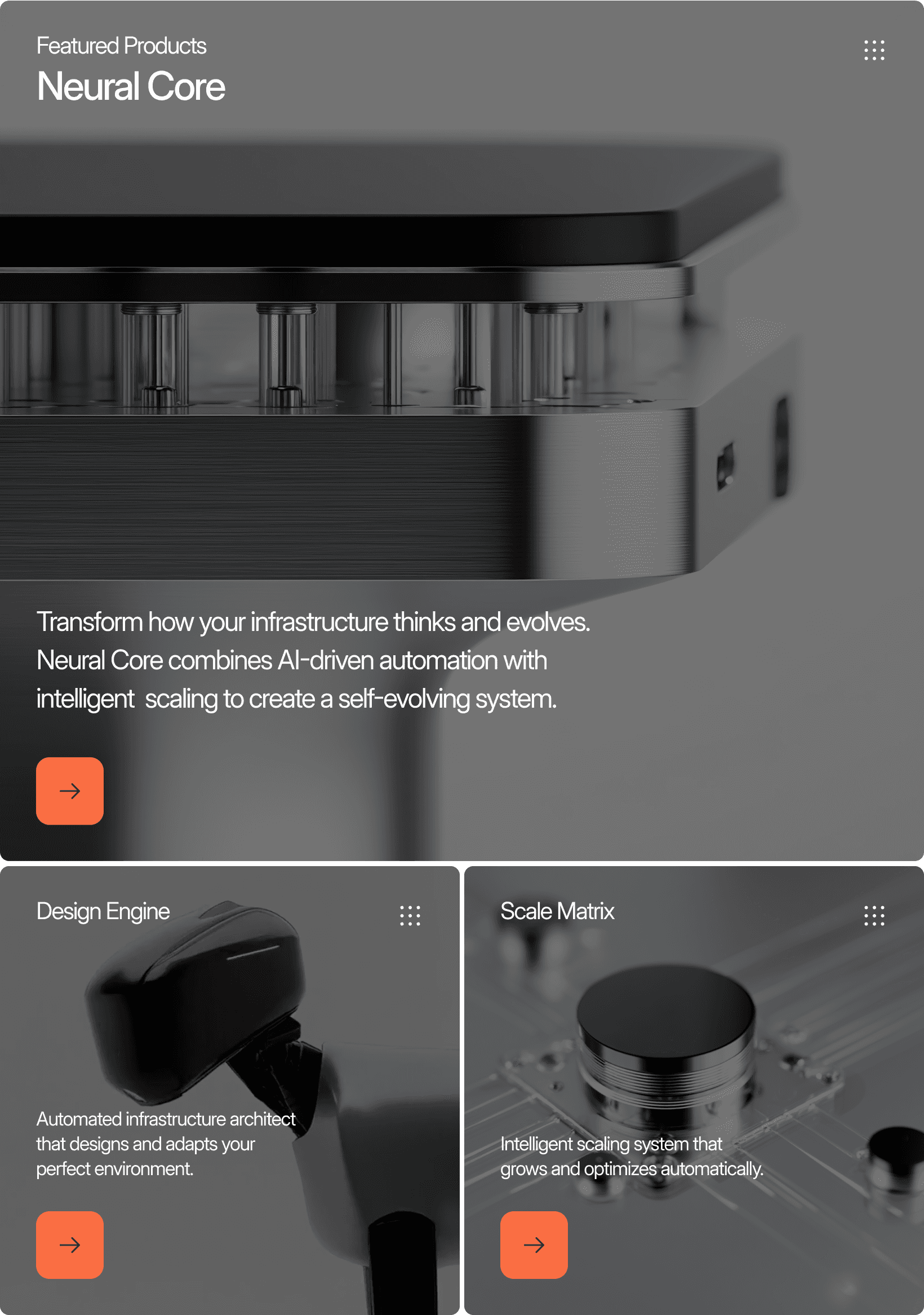
Product Card
Product Cards
Modular content boxes featuring products, including images and videos. Easily editable with product cards.
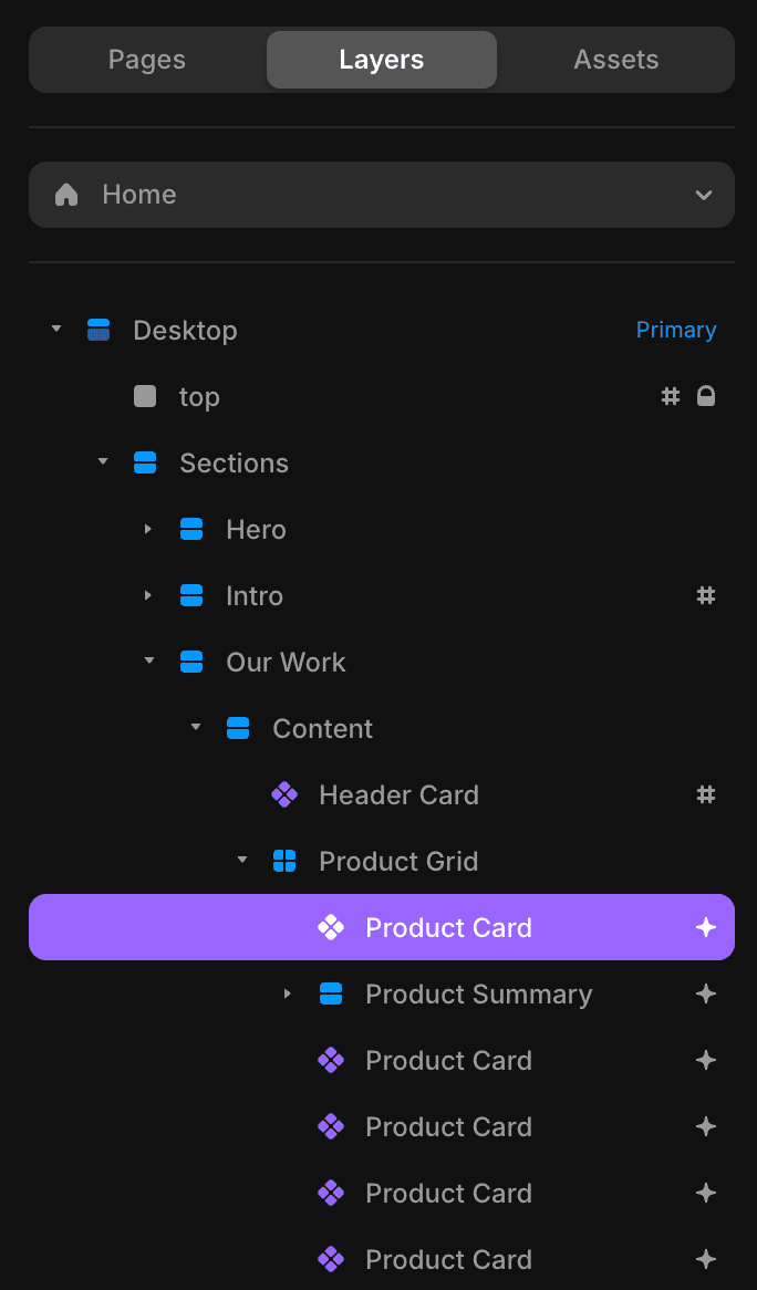
Sidebar
Where to Find
1. Open Layers panel in left sidebar
2. Navigate to: Sections → Our Work → Product Card
3. Click to reveal properties in right panel
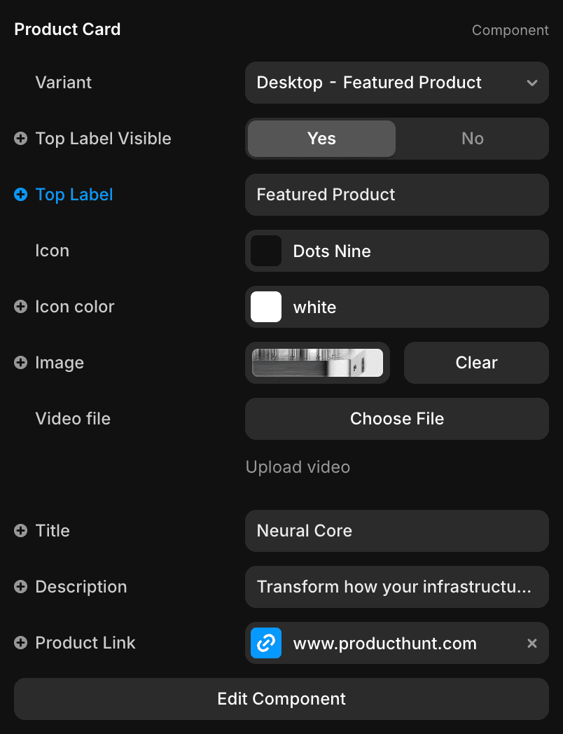
Property panel
How it Works
1. Choose Variants: Featured Card or Normal Card.
2. If you want to feature tag appear on the product card just switch "Top label" toggle visible.
3. Select icon
4. Add your image or video
5. Edit Title and Description
6. Add your link to your product.
Screenshot
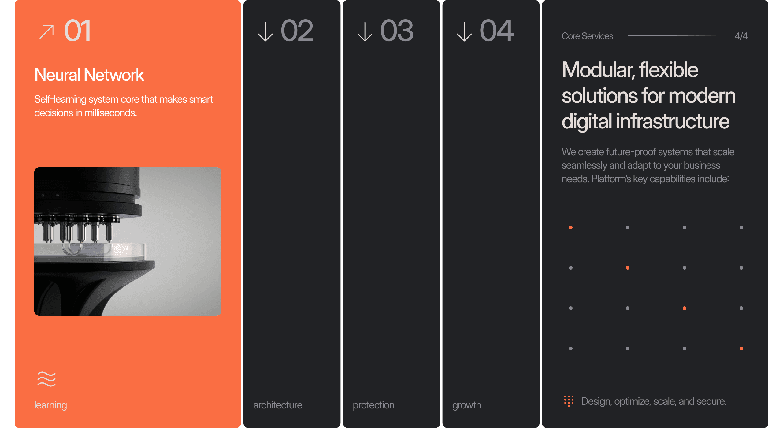
Services Module
Services
Each of the four columns to reveal service information. Customize the content to fit your needs by replacing text and images.
Sidebar
Where to Find
1. Open Layers panel in left sidebar
2. Navigate to: Sections → Services → Services Module
3. Click to reveal properties in right panel

Property panel
How it Works
1. ID appears in large number on the card
2. Select icon
3. Edit Title and Description
4. Add your Image
6. Edit card tag
Screenshot
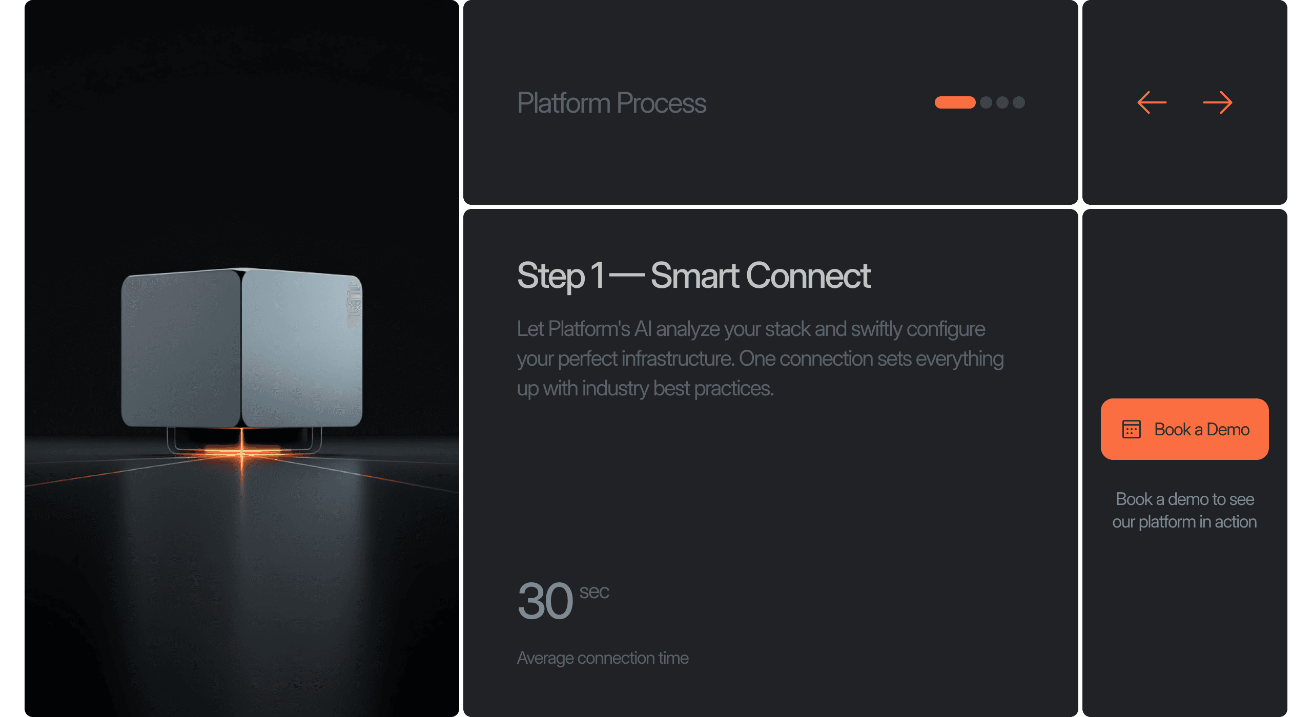
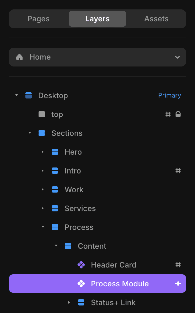
Process Module
Our Process
Edit and customize each step of your process to align with your workflow.
Sidebar
Where to Find
1. Open Layers panel in left sidebar
2. Navigate to: Sections → Process → Process Module
3. Click to reveal properties in right panel

Property panel
How it Works
1. Edit Title
2. Step image
3. Edit step details
4. Process time, unit and description

Image 1

Image 2
If you need more steps than the default 4.
1. Image 1 - Find the Process Module on the layer palette
2. Right click on the component
3. Replace With / Project / Modules /
4. Choose the module you want 4,5,6 steps.
Image2 - Don't forget to set the
Desktop - Step 1 Variant to Tablet - Step 1 and Phone - Step 2. on the property panel.
Screenshot
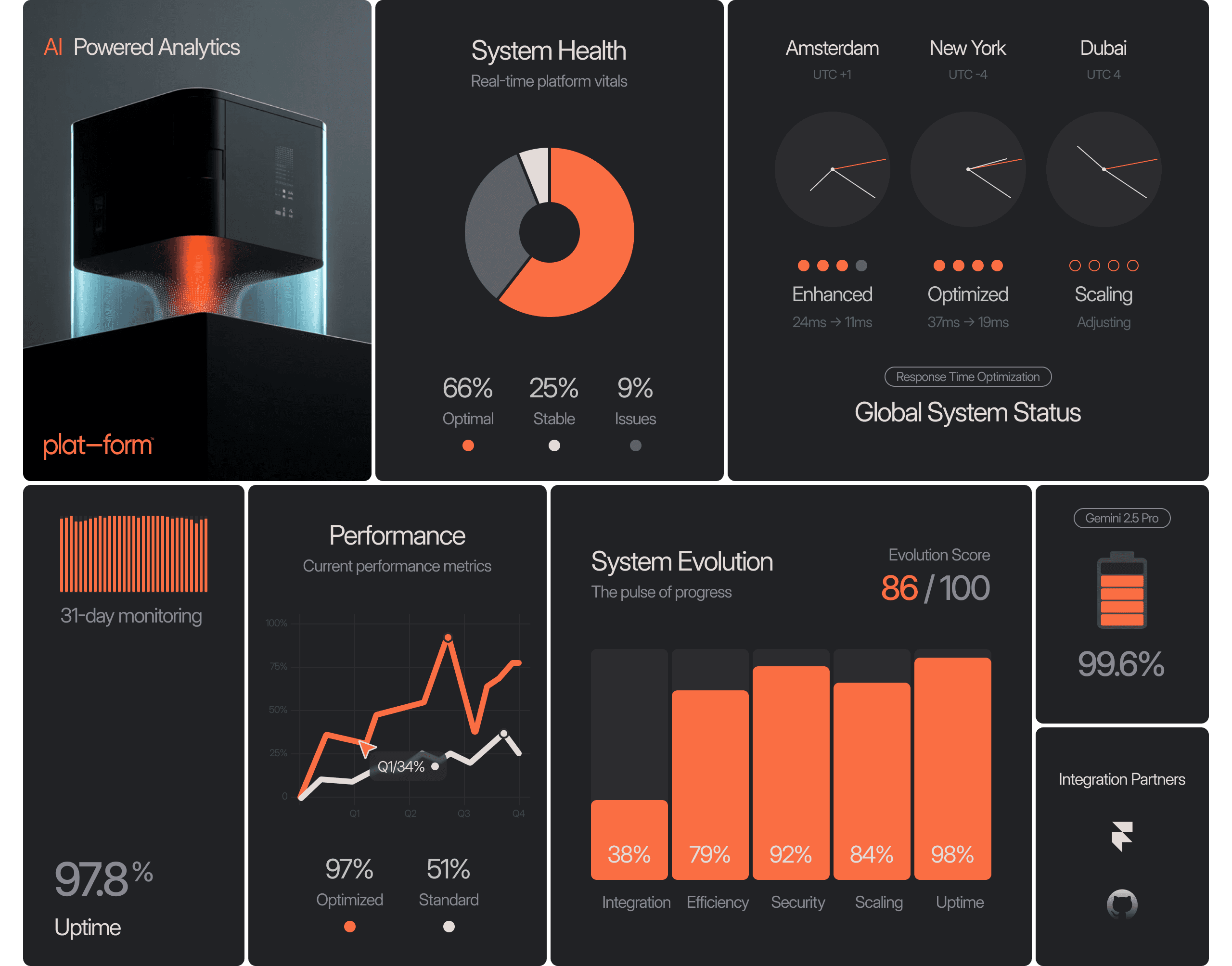
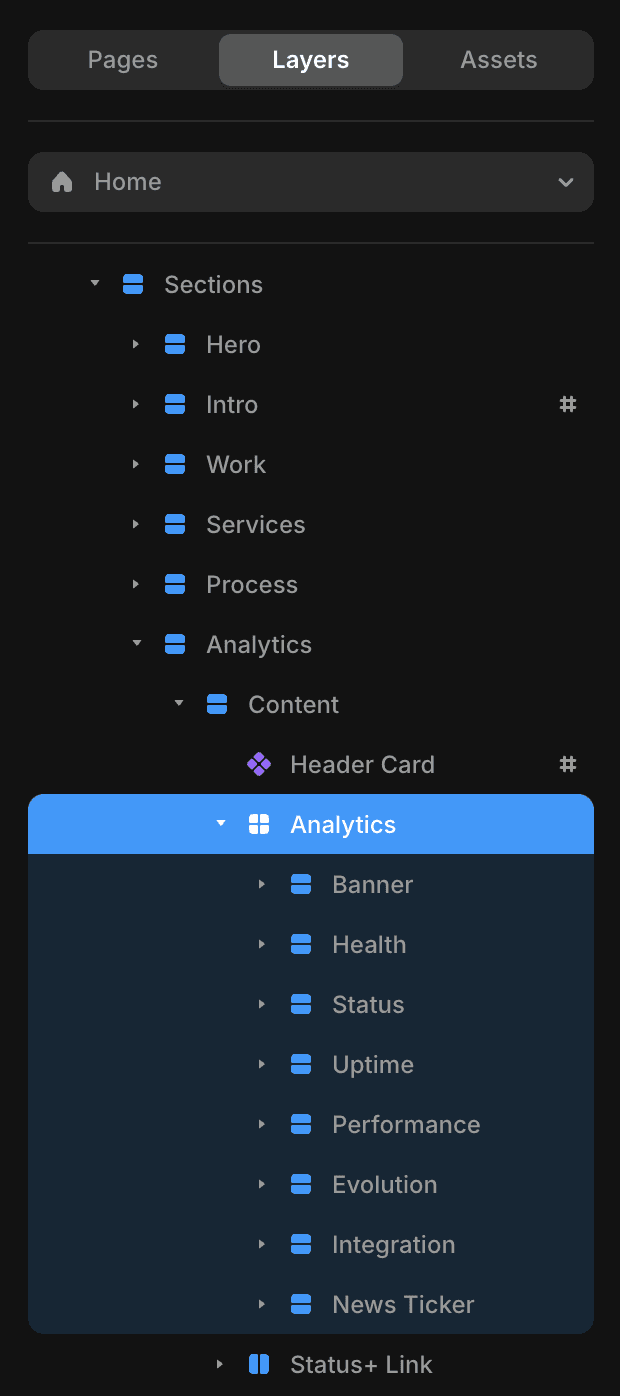
Analytics
Smart Analytics
Customize multiple analytics cards directly or via the card property panel for tailored insights.
Sidebar
Where to Find
1. Open Layers panel in left sidebar
2. Navigate to: Sections → Analytics → Analyics
3. Click to reveal properties in right panel

Screenshot
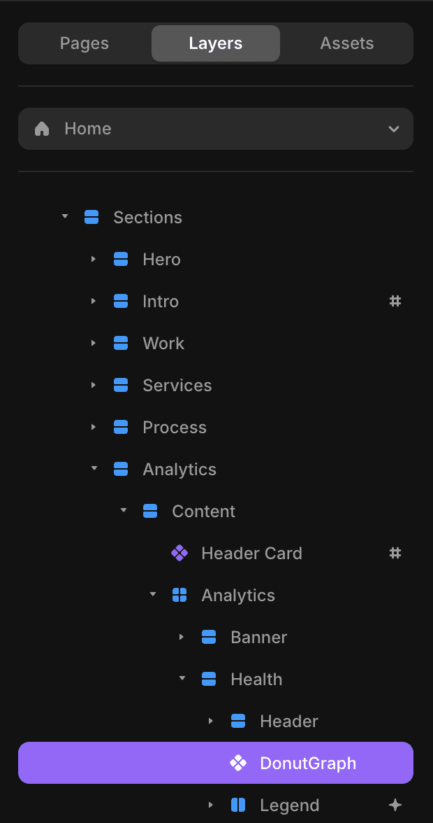
DonutGraph
Pie Chart
Customize multiple analytics cards directly or via the card property panel for tailored insights.
Sidebar
Where to Find
1. Open Layers panel in left sidebar
2. Navigate to: Sections → Analytics → DonutGraph
3. Click to reveal properties in right panel
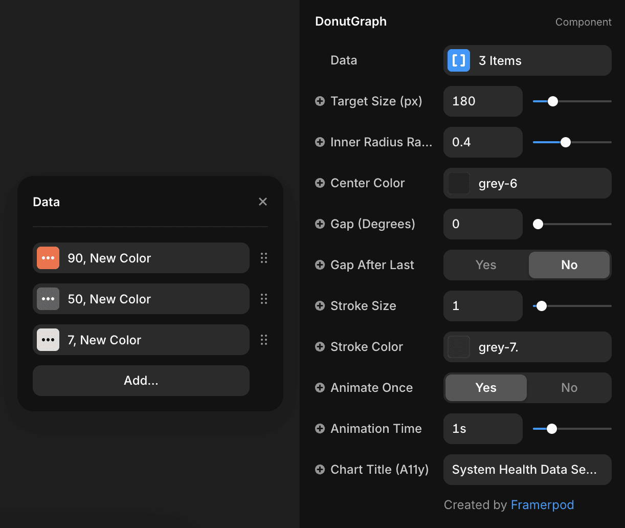
Property panel
How it Works
1. Edit Data: Adjust data values and colors to represent different metrics.
2. Add Slices: Click the "Add" button to introduce more slices to the donut chart, customizing each with specific data and color.
3. Set Values: Input numbers for each slice to accurately depict proportions within the chart.
There are more additional settings to customize the donut chart